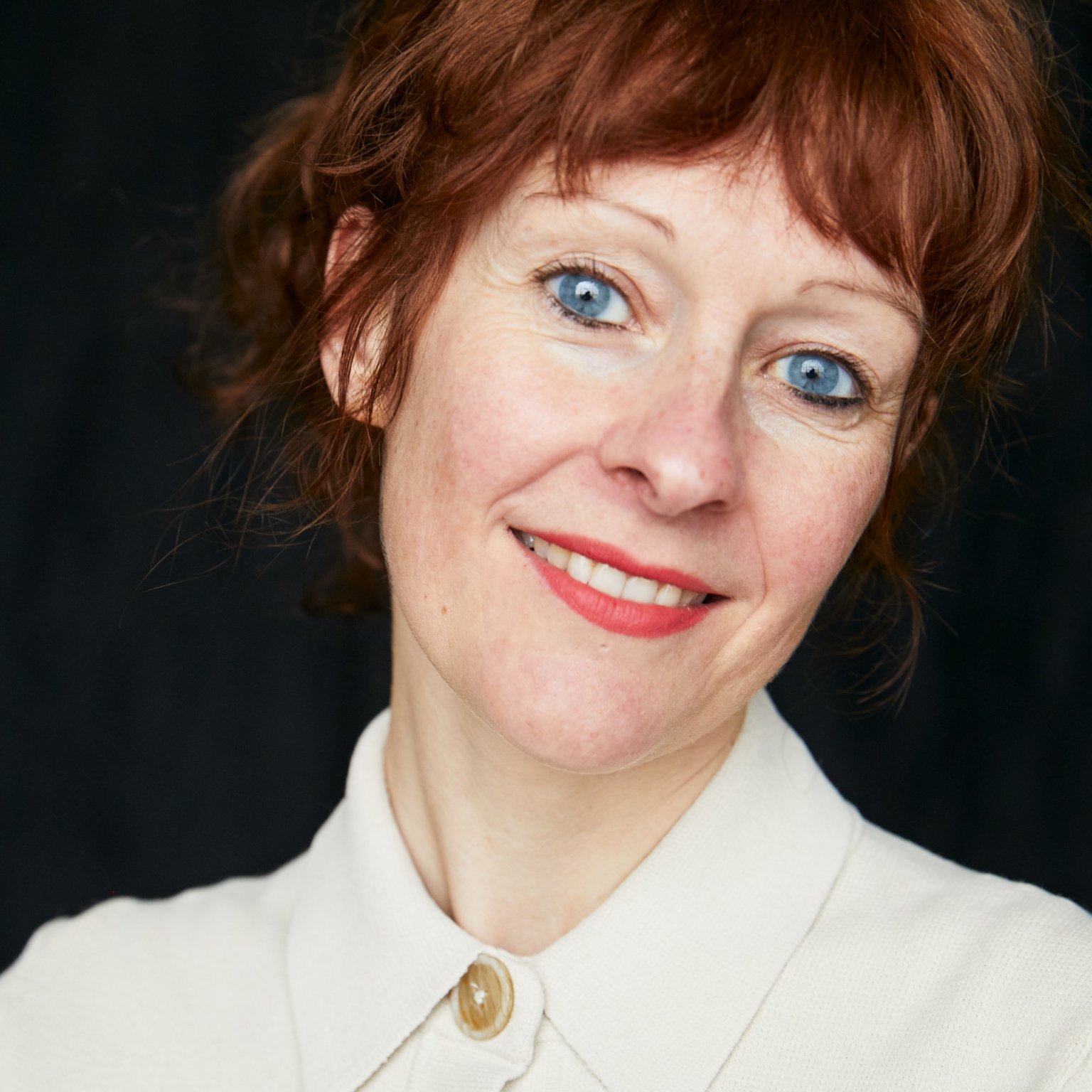
Giorgia Lupi, artist and information designer from Italy. Photo © Jake Chessum
This interview aligns with the ‘Nature and Culture’ campaign initiated by the Culture For Causes Network in November 2022. Within this framework, an exhibition titled ‘Reconciliation with the Living’ was exhibited in Paris at UNESCO HQ, focusing on the theme of harmonizing humanity with itself and the natural world; the exhibition travelled to Florence and to Lisbon as well. Additionally, MuseumWeek 2023 featured numerous hashtags related to environmental topics. A video series titled ‘Nature and Art’, a collaborative effort between UNESCO and the Solomon R. Guggenheim Museum, was also showcased as part of this initiative.
Who said data is difficult to understand? Thanks to maps, graphs, and diagrams, any data relating to a particular phenomenon can be deciphered through a process of interpretation in which the visual impact of colors and shapes offers us an immediate reading.
Giorgia Lupi (Rome, 1981) is an Italian artist, information designer, and advocate for data humanism who, having moved to the United States, has made research, data, and graphics the essence of her artistic production by relating art, data, and research.
After obtaining a degree in Architecture at the University of Ferrara and studying design at the Polytechnic of Design and at the Domus Academy in Milan, after various experiences in design agencies, in 2014 he founded Accurat, her own design studio in Milan and New York. Her work is exhibited at MoMA and the Smithsonian Design Museum, among others.
Understanding the place in which we live, and understanding the environmental, cultural, and social dynamics are important for coexistence in the world, from the smallest to the largest habitat.
Thanks to technological progress, research has improved a lot in understanding the needs and therefore the emergencies that above all our Earth asks us is asking us, on a daily basis: climate change and earthquakes it is in fact screaming at us that something is changing and the actions and the habits of human beings must necessarily change with respect for everyone; a fundamental aspect is also to communicate this data with maximum diffusion and avoid misinformation in a world made of easy fake news between artificial intelligence and social networks.
Winner of the 2022 National Design Award for Communication Design in Milan, Giorgia Lupi tells her story through her experience in the field and her projects.
As an Information Designer, your production focuses on Data Humanism: you use data to understand our society and its performance. How was this passion for art, data, and research conceived?
Data Humanism is my approach that sees data not only as cold numbers but as an abstraction of reality. Data is a filter we can use to see the world one subject at a time to better understand it. This approach only works if we include the human qualities found in data, however: context, missing data, imperfection, and uncertainty.
Data is not perfect and is always subject to collection errors and interpretation, but through design data, humanism comes alive. When we can render data visually, people are able to understand and experience it in a new, more human, way.
From Italy, you moved to the United States where you co-founded a company. How much has this aspect influenced your work?
Being born and raised in Italy has greatly influenced my work. Growing up in Italy is like living inside a design museum. Everything you see around you is intentional, well-crafted, and designed. There is so much diversity in the visual environment that even the aesthetic of the architecture starts to seep into the way you think and, therefore, design.
Even the word for design in Italian, “progettare”, which is a mix of planning and making has shaped my approach to design. Moving to New York specifically has also greatly influenced my work. I found myself very at home in the energy and pace of innovation that permeates this city, and I am sure it has added to my work in more ways than I can count.
Can you give us an example of how your work is done?
All of my work begins with the data. There are very human stories to be found in the data that I and my team then teased out and visualized in ways that will speak to different audiences.
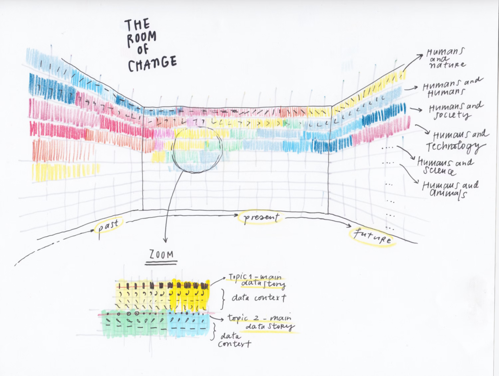
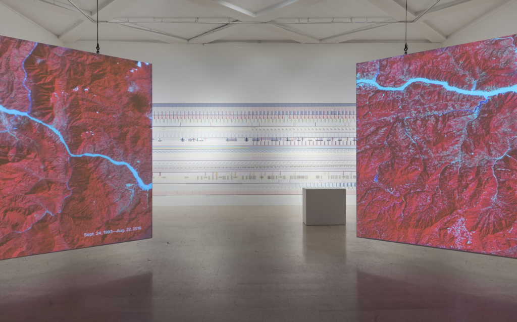
Can you tell us about “The Room Of Change”, one of your most famous works created for the 2019 Milan Triennale?
The Room of Change was a 100-foot-long data mural that illustrated how multiple aspects of our environment have evolved and will likely continue to change, pulling together many streams of information—world population, disease rates, energy consumption, and average temperatures—that address many of the topics presented in the exhibition.
From left to right, time flowed on the wall through abstract visual patterns, covering our past, present, and future. The data represented began in 1000 B.C. and runs into a speculative future ending in 2400, echoing some of the exhibition’s overall aims.
Each horizontal band depicted the evolution over time of one single story of change, told through a combination of data sets on the topic, while each vertical section of the wall was a picture of a precise moment in time.
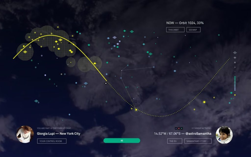
“Friends In Space” is a data visualization app and social network that was launched in Space in collaboration with astronaut Samantha Cristoforetti. How did the idea for the project come about?
The project was sparked by a Twitter conversation in early 2014, while Sam was preparing for her mission. The conversation led to Sam asking if the data from her mission could be used to reach out to people as she flew above them.
We agreed to create a special interactive experience using data from the mission. We conceived and developed a web-based digital app that integrated real-time data streams from the ISS within a visual interface that could be used simultaneously by thousands of people around the world.
In some way do you think Data Design can combat misinformation?
Yes! Data is everywhere: in every headline, and at the center of every conversation. In only a few months since the pandemic began, data of all types has become an essential language to understand and make sense of a rapidly changing world.
But how fluent in this language is the general public? And how can we as practitioners and researchers design data visualizations that fully represent the nuances and the implications of a very complex situation?
Due to the media coverage of the COVID-19 data, we have been exposed to (very) bad and (very) good examples of visualizations. We’ve seen visualizations used to both clarify and hide arguments, to both support and deny research evidence — even as tools for propaganda. We want to make sure we’ll always contribute to clarity and consistency, being fully aware of the potential risks and pitfalls and — in the end — the responsibility of shaping data and making it available for public discourse.
What topic are you specifically focusing your research on?
We work on topics of all types, for all types of clients: from large multinationals to one-person start-ups. What unites all our work is an interest in communicating complex, nuanced information to a wider public. We’re especially interested in making critical information more accessible to a general audience.
We see a trend towards simplification in all communication. While simplification has its place, we believe it often leads to the loss of important context or nuance. We try to use creative storytelling and narrative to elevate this context in ways that make it digestible for the normal reader. Designing with data has a magical ability to transform cold numbers into emotional and resonant experiences.
Interview by Fabio Pariante, Twitter / Instagram / Website